MelvinHatcher

Planning your portfolio in InDesign

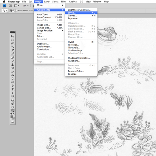
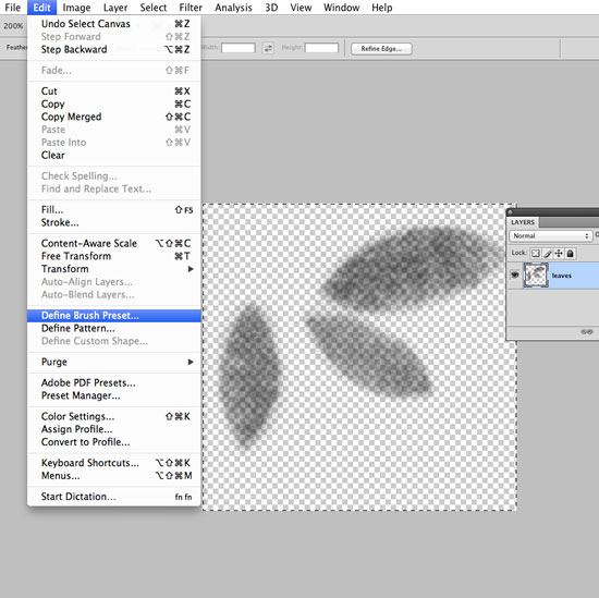
Conference season is in the air, so I thought I’d show you a quick way to plan out your physical portfolio using InDesign and Acrobat. I have to credit Tracy Bishop for this tip. I don’t know about you, but I wasted a lot of ink and paper before I figured this method out. Doh!


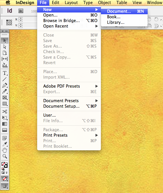
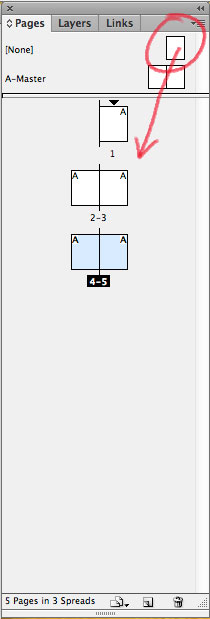
In my last post I showed you how I organize my picture book dummies using InDesign. Planning a portfolio is pretty much the same process. I open a new document in InDesign creating pages the same size as my physical portfolio. For more details, check my last post here.image

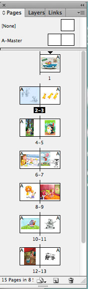
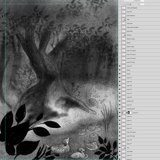
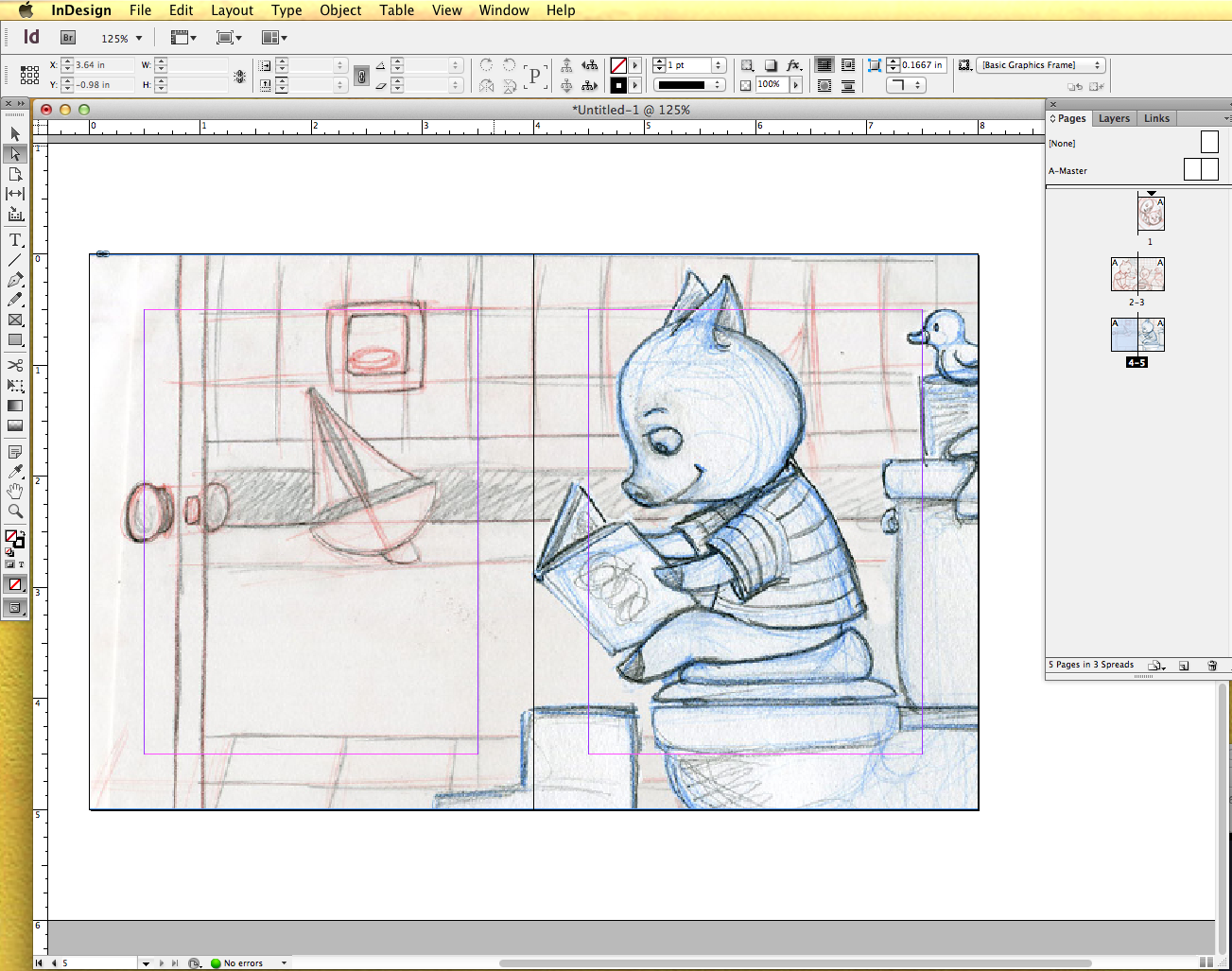
As you can see, I figured out how many pages I wanted and have placed my art already. It’s really easy to click and drag the pages in the page menu to rearrange them. I can decide whether to leave blank pages or to group related pictures together. I can also figure out how big each image should be.

image

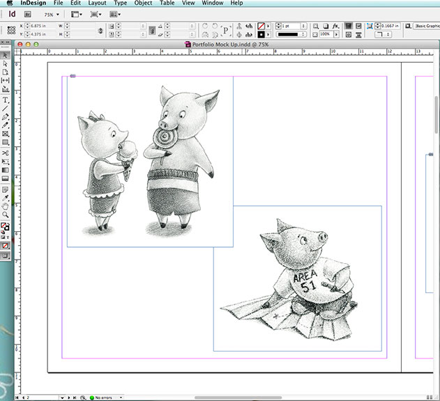
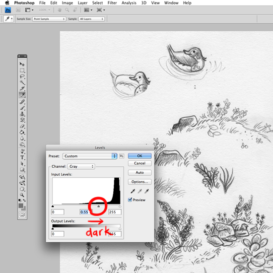
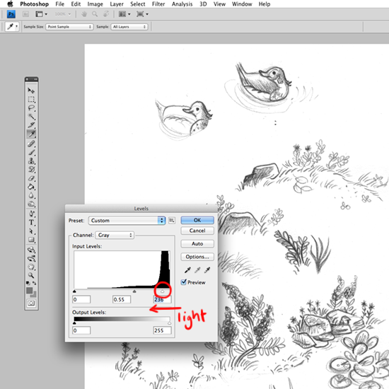
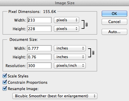
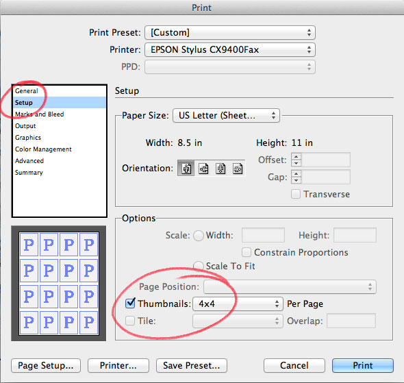
Once I have the art the size I want, I can click on each image to see what size it is and print it at that size in Photoshop. Easy peasy.

image


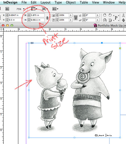
You can also export this as a pdf and load it on your iPad or other tablet. 

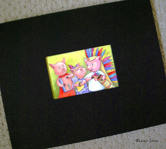
Here’s my portfolio (for now). I’m using an 11×14 Kolo album. It’s an inch too wide for the SCBWI National Conference this summer in Los Angeles, but I wanted my art as big as possible. I’ll have to figure out something else soon.

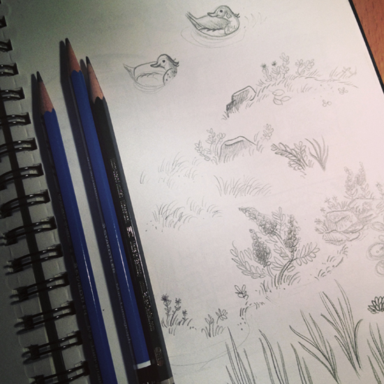
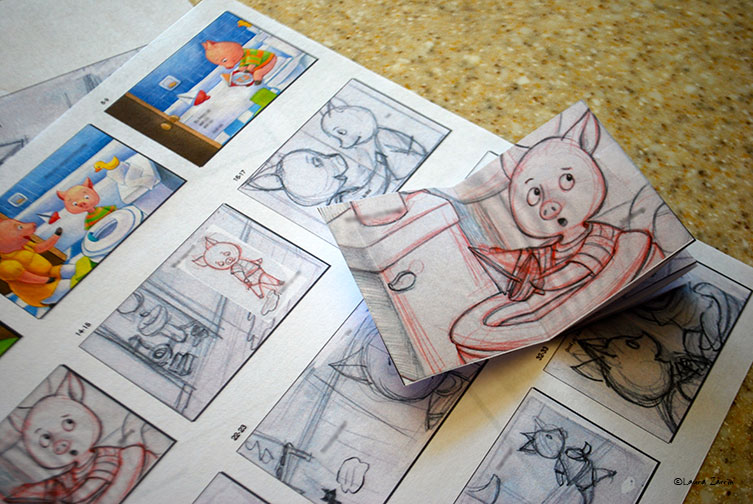
With the Kolo album, you can get pages that you can print directly on. My printer doesn’t cooperate, but maybe yours does. I print my images on Epson Ultra Premium Photo Paper Luster and mount it on the portfolio pages using StudioTac. Tracy also introduced me to StudioTac. I use the low tack version so that I am able to reposition things if necessary. It’s so easy to use! You just put your image on it, burnish over the image, then adhere it to the page in your portfolio.


image

I wanted my name on the portfolio, so here’s what I used as page one.

image


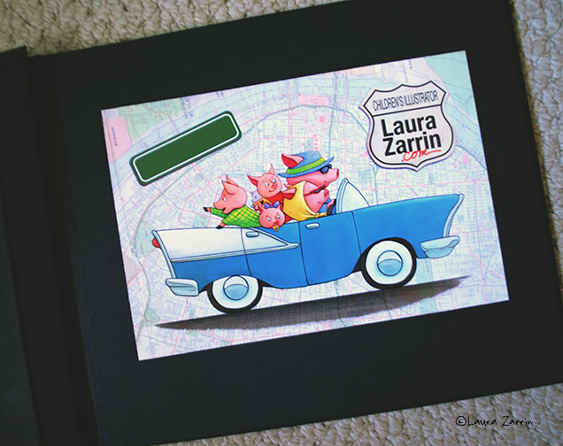
I consulted this post by Molly Idle to figure out the look of my portfolio. I like that she’s creating a portfolio that feels like a real book.


Nuts and Bolts: My Photoshop and Wacom Setup

Lately I’ve been doing a lot of experimenting with actual paints and brushes, but for the past six or so years, I’ve been completing all my projects using Photoshop CS4.

Over the years, I’ve figured out a system using Wacom’s programmable ExpressKeys, Touch Strip and Radial Menu that helps me paint quickly and efficiently.  Using these programmable keys along with a specific Photoshop window arrangement allows for faster painting…get those deadlines done!

First things first, I’m working on a two or three year old iMac 23" and a Wacom Cintiq 12wx (the ExpressKeys are also available on the Wacom Intuos 3’s, 4’s and 5’s too). Below the video, I’ve included diagrams of how I’ve set my Wacom Cintiq’s programmable options. Remember, the programmable keys come on the Intuos tablets as well, so if you don’t have a Cintiq, all is not lost!


Wacom’s ExpressKeys

The Cintiq and Intuos tablets come with programmable keys located on both sides of the tablet. I’ve disabled the ExpressKeys on the left of my tablet being that I’m left-handed and it’s just too much of an inconvenience to use while I’m trying to paint! There is a slight difference in how the keys are set up depending on how old your tablet is, and here is how mine are set up. The letters/symbols in parenthesis are the keyboard shortcuts I used to program the functions into the HotKeys in my Wacom preferences.

image

Wacom’s Radial Menu

In Wacom’s preferences menu (under Apple’s System Preferences), you can find the options for customizing your Radial Menu. Here’s a close-up version of how mine are programmed:

image

Screen Setup:

The most thing for me here is to have a smaller version of my current painting file open so that I can see  the image as a whole. To do this, go to ‘Window’ on the menu bar, drop down to ‘Arrange’ and then select ‘New window for ….". Having this smaller window open is a huge help and is very similar to stepping away from your canvas or squinting so that you can see how your painting is coming together in terms of warms/cools, lights/darks, etc.

I hope you enjoyed! By the way, I’m sure we’d all love to hear some cool tips and tricks that you’ve put into place regarding your tablet and Photoshop! Let us know your favorites!

~christina

It's not about the brush: Digital Watercolor in Photoshop

What I’ve been messing around with the most for the past 3 years is with Photoshop. I’ve been researching, experimenting, and trying to figure out ways to get a watercolor-ish looking method to paint that was fun for me and not so processor intensive for my computer. I eventually came across Zoe Piel’s video tutorial series about how she approached digital watercolor painting. It was a revelation to me. It looked good and it was simple. It wasn’t about the brush at all. After that I found Tony Cliff’s tutorial about using an overlay texture layer. The way I now paint, as seen in the video demo, combines both methods. The video is about 11 minutes but you can stop watching half way through. After the half way mark I’m done explaining how I do things and just ramble on while I’m finishing up the sketch. I hope it’s helpful to you!

TracyBishop-WatercolorDigitalPainting from Tracy Bishop on Vimeo.

Here are the brushes that I use in the demo for you to download:

I know the point of the demo was that the specific brush was kind of secondary, but it’s still fun to try out new brushes. Here are some of my favorite brushes:Free:

Paid Brushes:

From Sketchbook to Screen: Black and White

My last post was about how I’ve been trying to get back to my painting roots and become less of a digital artist. Besides attempting watercolor, there are other ways I go about trying to accomplish this: One of them is by using scanned a page from my sketchbook in a finished piece. To explain how I go about this very tricky business, I’m going to show you the scary inner workings of my Photoshop layers for this illustration:

image
Jody from The Yearling is REALLY just crying about how messy my Photoshop layers are.


*I can go into more depth, but to keep it simple I’ll start with just black and white art. Next time, I’ll go into the beast that is color. 

This particular assignment was for the most recent SCBWI Tomie dePaola contest in which he asked for a black and white piece. I had just read this interview with Jon Klassen (author/illustrator/Caldecott winner) over on Seven Impossible Things Before Breakfast. The way he describes his own process is very much an organic blend of making shapes and positioning them together digitally. I thought this would be a great way to practice combining both traditional and digital media in my own work.

So, to get started, I read The Yearling… SOBBED my eyes out, composed myself, chose a moment, and finally then started sketching. My ideas came out in pieces: Jody, the bitterns, the forest, ducks, the pond, grass, plants, weeds, etc. Here are some pages directly from my sketchbook, in which I used both a pencil and ink brush pen:

image

image

image

I scanned all of these images at 600 dpi, a nice, adjustable size for my tiny sketches. I knew I wanted to be able to make those inked plants really big and put them in the foreground as silhouettes. That being said, once your image ends up in Photoshop, it’ll probably still need some help. Here’s what I do:

Adjusting Levels

1. Go to Image > Adjustments > Levels:

image

2. Move the middle triangle to the right to make increase contrast (making your lines darker):

image

3. Move the right triangle to the left to brighten the whites:

image

Now you can copy and paste the pieces into a new file and set the layer to multiply to see only the line. And now I’m ready to show you my monstrosity of a 75 layer Photoshop file (I’ve had up to 400 layers in one file, btw). This image shows less than half of the layers I used, but you can sort of see (with some layers turned off ) how it works. I positioned the ducks together, overlapped the plant in the foreground, and arranged the wildflowers and rocks into a scene. I normally label my layers, but I must have been in a hurry this time. 

*TIP: If you have a messy unlabeled file like me, you can press "V" for the Move Tool and right click on any object to find the layer it’s on. It works better than turning layers on and off until you find the right one. You’ll be pulling your hair out by the time you find it. 

image

Here’s a closeup of Jody, who’s entire self exists on just 4 nicely labeled layers (sketch, multiple shadow layers, and a white underpainting):

image

When it comes to the background, one helpful thing to help you fill in details like tree leaves, is knowing how to make a Photoshop brush. It’s SO easy. Specifically, here’s how I made a leaf stamp for the above image:

How to Make a Photoshop Brush:

1. Create a new file at 300 dpi – good dimensions are somewhere between 200-500 pixels (mine is a weird dimension because I cropped the file when I finished drawing leaves):

image

2. Make a new layer over the background white and start drawing what you want your brush to look like, in this case – leaves!

3. Once you have your image, delete that white background (by default this layer is locked, unlock it by  OPT+double click):

image

4. Press CMD+A to "Select All" then go to Edit  > Define Brush Preset…

image

5. Name your new brush.

image

6. Find your brush in your brushes palette, select it, and use it!!

image 

image

*TIP: If you click on Brush Tip Shape in the Brushes Window, you can change things like rotation and size, which help to aid the variance and organic quality of your brush. 

7. Make sure to save your original Photoshop file so you can make the brush again easily if you happen to lose it!


And that’s a wrap on how to combine sketches with your digital art. I hope this was a helpful resource for some folks, but if you have any questions please feel free to post in the comments. Next time I’ll elaborate more on what I do for color images! 

In other news: Recently, I was interviewed by the awesome Bill Turner over on his blog, The Tools Artists Use: A fine resource to learn more about many illustrators, cartoonists, comic artists, etc.  

Thanks for reading!

Cheers!~Renee

Tools for organizing your dummy

Creating a book dummy can be a daunting process. I welcome anything that makes it easier! I’ve found that InDesign by Adobe is the perfect tool for a project this size.

There are lots of other articles on creating dummies. Here, I just want to give you a peak at how I use InDesign in my process.

First, open a new document:


image

Drag to add pages in the Pages palette to your document.

image

I scan in my thumbnails, place them on the pages and adjust the size to fit the page.


image

Using InDesign allows me to then print out thumbnails of the entire dummy on one or two pages. This makes it easy to figure out text placement, flow, page turns, etc. I love this feature! It saves tons of time for me. I print at the 4×4 size which gets the whole dummy on two pages.

image

I also use it as a to do list of sorts to track my progress on a project. I check it off page by page as I work. As I complete more finished drawings, I replace the roughs. Later, when I’m painting, I scan and add each page as I go. It gives me a great sense of accomplishment as I see the finished pages multiplying and the book really coming together. 

As I’m working my way through more finished drawings, I replace the roughs. Later, when I’m painting, I scan and add each completed page to the dummy in InDesign as I go. It gives me a great sense of accomplishment as I see the finished pages multiplying and the book really coming together.

imageDon’t be afraid of using InDesign. This is a very basic usage of it that anyone can handle. I’m using CS6, but older versions work just as well. I hope this helps you on your next project. In a future post, I share how I use this program to plan my physical portfolio.

Moving Outside the Box

Much like Renee previously wrote about in her blog entry, I too, spent a long time painting in oils. I discovered oils in my last year of college and fell in love with their rich, buttery color and texture. By the way, if you’re looking for the most scrumptious (figuratively, NOT literally of course) oil paints ever, I suggest you go and pick up some tubes of M. Graham walnut-based oils…the best!


But then…along came my first child in 2006, and given my tendency towards being a messy painter, I decided that having toxic paints around small children was probably not a good move. So, I went completely digital.

For the past seven years, my art has been completely created using Photoshop. And while there are definitely benefits of going totally digital, I’ve reached the point that I am feeling completely "boxed" in by creating on my Wacom–essentially a 12" square of plastic. So, out have come the pencils, pens, brushes and…PAINTS! 

image

It’s been wonderful to get back into creating art the old fashioned way: there’s no Command-Z to rely on anymore!  For me, no "undo" button means happy accidents, which I hope will lead to an energy in my art that I feel gets watered down when I paint with Photoshop. Eventually, I would like to figure out a successful way to merge both digital with traditional methods to create illustrations that match my style.

I can’t wait to rediscover art in the traditional sense and share my discoveries here with you all! I’m looking forward to getting my fingers dirty and simply…messing about!

imageToodles!~christina


Speed Sketching Dojo

TracyBishopKarateSketch01

Last summer my son started taking karate class. It didn’t take long for me to realize that while it’s fun for him, it’s BORING as a parent just sitting on the side the entire hour. So I decided to turn my son’s class time into my own dojo of speed sketching.  I have a classroom full of cute models so I had to take advantage of that.

Since I’m mainly a digital illustrator I try to keep my analog skills fresh by keeping a sketchbook (so no iPad sketching for me). My goal was to loosen up and try to exercise my drawing hands. It seems obvious but trying to draw a dojo full of moving kids is tough. Eventually I landed on a strategy where I just focused on capturing the general motion. I filled in the details like the face and hairstyles later.

TracyBishopKarateSketch14 Another strategy was to use a pen instead of a pencil. That way you avoid the temptation of being timid and laying down light lines so you can draw over it. With a pen you’re forced to commit to a line and it either works out or it doesn’t. You can’t be precious with it.

With this kind of sketching you end up with a messy sketchbook with half-formed lines and blobs that don’t make sense. But once in a while I hit on that little drawing where everything comes together and that makes me happy.

TracyBishopKarateSketch18TracyBishopKarateSketch15TracyBishopKarateSketch06TracyBishopKarateSketch19

Tools used:

  • Sketchbook: hand•book journal co.’s sketchbook

    I really like the weight and texture of the paper. It has just enough tooth that it takes ink and watercolor really well.
  • Brush pen: Kuretake Fountain Brush Pen

    I know this pen is a little pricier than the popular Pentel Pocket Brush Pen but the Kuretake’s brush is shorter than Pentel’s and this makes all the difference in giving me more control over the lines I make.
  • Ink: Platinum Carbon Pen Ink Cartridge

    I use this ink because it’s waterproof.

Watercolor my World

It’s the beginning of Spring here in Boston, a time of new beginnings and rebirth. There’s no mistaking a change in the air when you get that one extra hour of sunlight! In the Spring, I start to reassess where I’ve been and where I’m going. This year I chose to focus on my art style. Lucky for me to find three talented ladies in the same boat!

As we previously mentioned, the goal of coming together on this blog is to help not only each other, but offer advice to anyone else who might need a lift. I’m thinking of it like a journal. Down the line, there’s bound to be a story you’ll connect with to help steer you in the right direction.

Here’s my first story:

I studied oil painting in school by choice. 15 years ago, I had different goals and different influences, but things change. After school I got a job in the animation industry and suddenly I was a digital artist frantically learning new skills and software, letting my paints dry and crumble. How sad to forget about something you studied in such depth!?

A few months ago, tired of leaving them half full, I started to make myself draw in my sketchbooks. I thought it might be helpful to use Instagram to share photos of my sketches (social media "cheerleaders" are your best friends). Because of the reactions I got, I kept going. I learned to draw more freely and be less dependent on the Cmd+Z.

image

A few months into posting sketches, I pulled out my Pentel brush pen:

image

Having that solid pencil sketch made adding a more permanent line actually fun to do. Being able to manipulate a brush pen got me to thinking (uh-oh). 

Here’s the conversation that happened in my head:

"I need to relearn how to paint."

"But oil paint is too messy."

"And smelly…"

"What if my cat eats the paint and dies?"

"There has to be another way."

"Water…

…Color"

"!"

It sounds so silly listed like that when actually, over time, I just developed new influences and became more fascinated in a particular picture book illustration style. (A style you just can’t replicate in Photoshop, believe me I’ve tried!) My husband focused on watercolor in school and we had a "Painting Sunday" where he showed me some techniques. Our cat, Timmy, was happy I chose water over oil and so eager to pose:

image

I kept dabbling for a bit on my own:image

Then I discovered a local watercolor class with illustrator, Dan Moynihan. I can’t imagine taking a class these days unless the teacher is someone I greatly admire and want to learn from. Dan’s style is cartoon. My style is cartoon. Perfect! I was relieved to find that class #1 had us starting from the very basics. There is absolutely no pressure to finish anything and make it look "perfect," which I have been trying to do for 15 years.

I’ve only been to a few classes so far, but taking a giant leap backwards has been extremely helpful. It can seem gruesome to have to start all over, but it’s never too late if you don’t freak out (*quote of the day). Patience is so hard to find, I know.

The reintroduction to value and hue studies is one of my particular favorites:

image

Through this simple test, I’m discovering what colors I like best and realizing I can probably subtract a few from my palette (i.e. second row from the top left – ultramarine and cobalt look close enough to probably choose just one):

image

My first palette (that I will eventually condense):

-Cobalt Blue

-Ultramarine

-Viridian Hue

-Sap Green

-Burnt Umber

-Yellow Ochre

-Quinacridone Gold

-Cadmium Yellow Hue

-Burnt Sienna

-Alizarin Crimson

-Cadmium Red Light Hue

-Cadmium Red

There you have it, the beginning of my sloooow, messy process of getting back into painting and the end of chapter one. If this ends up being a 25 chapter book, so be it. The second you stop learning is when the creativity stops as well, right? I’ll do my best to share what I learn on this blog and I’ll definitely keep posting frequent sketchbook photos on Instagram!

Please feel free to leave comments, ask questions, and so forth. I would love to keep the discussion alive!

Cheers!

~Renee

Hello!

Welcome to our new blog! We’re four children’s illustrators that are simply– messing about! Collectively, we are all on the same page, always experimenting and trying new things with our art. We’ve decided to come together on this blog to share these new experiences and techniques with you. With this blog we hope to not only document our progress, but encourage conversation. Think of it like an interactive art journal and please feel free to comment! Without further adieu…allow us to introduce ourselves:

image

Hi! I’m Tracy Bishop and I’m a children’s illustrator in San Jose, CA. For the most part I do my illustrations digitally but there is a lot of experimentation and influences outside the computer. I always like to try to combine the best of traditional and digital art but the process can get quite messy! In this blog I’m hoping to show all the behind-the-scenes thoughts and experiments as I try to constantly improve as an artist.image

Hello! I’m Christina Forshay, an illustrator specializing in creating art for kids. I’m coming to you from sunny southern California where I live with my husband and two kids. My art is usually super colorful and I love to create worlds of wonder for the viewer. My absolute favorite medium when painting is oils, but lately I’ve been working digitally to create my finished pieces. However, I’ve been getting a serious itch to use more paint, pens and collage in my work and I’m looking forward to sharing my artistic explorations here with you!image

Hi there! My name is Renee Kurilla and I’m an illustrator / animator living in Boston, MA. I’m currently one of the Lead Artists at FableVision Studios where I spend my days creating art for all kinds of digital children’s media including: books, games, and apps, to name a few. I devote all of my free time to making picture books and art for children, because I love what I do and the ideas never stop. After spending almost ten years as a digital painter, I have an undying urge to relearn the painting skills I once practiced in depth. I’ll be sharing the entire process of getting back into painting, including all the hiccups and the mess-ups, on this blog!

image

Hello! I’m Laura Zarrin. I’m an illustrator living in San Jose, CA. I used to paint with color pencils and though I love the control of this medium, not to mention the sound of the the pencil on the paper, deep down I craved getting looser with my work. I left control behind and spent the last couple of years experimenting with all sorts of media. Now I’m working with acrylic paints, collage, digital, and sometimes color pencils. I’ve left my comfort zone far behind while I sail through uncharted (for me) waters. Here I’ll be sharing all kinds of bumps, triumphs, messes of my creative life.

Copyright © simplymessingabout.com | All rights reserved