I think we all get asked where our ideas come from as if there’s a store you can go to and pick them out. Sadly, this is not the case. Ideas are everywhere. They’re in every interaction, random thought, daily task, dog walk, the Olympics (here), and even the news.
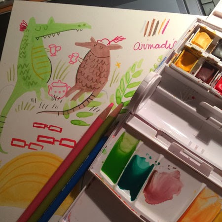
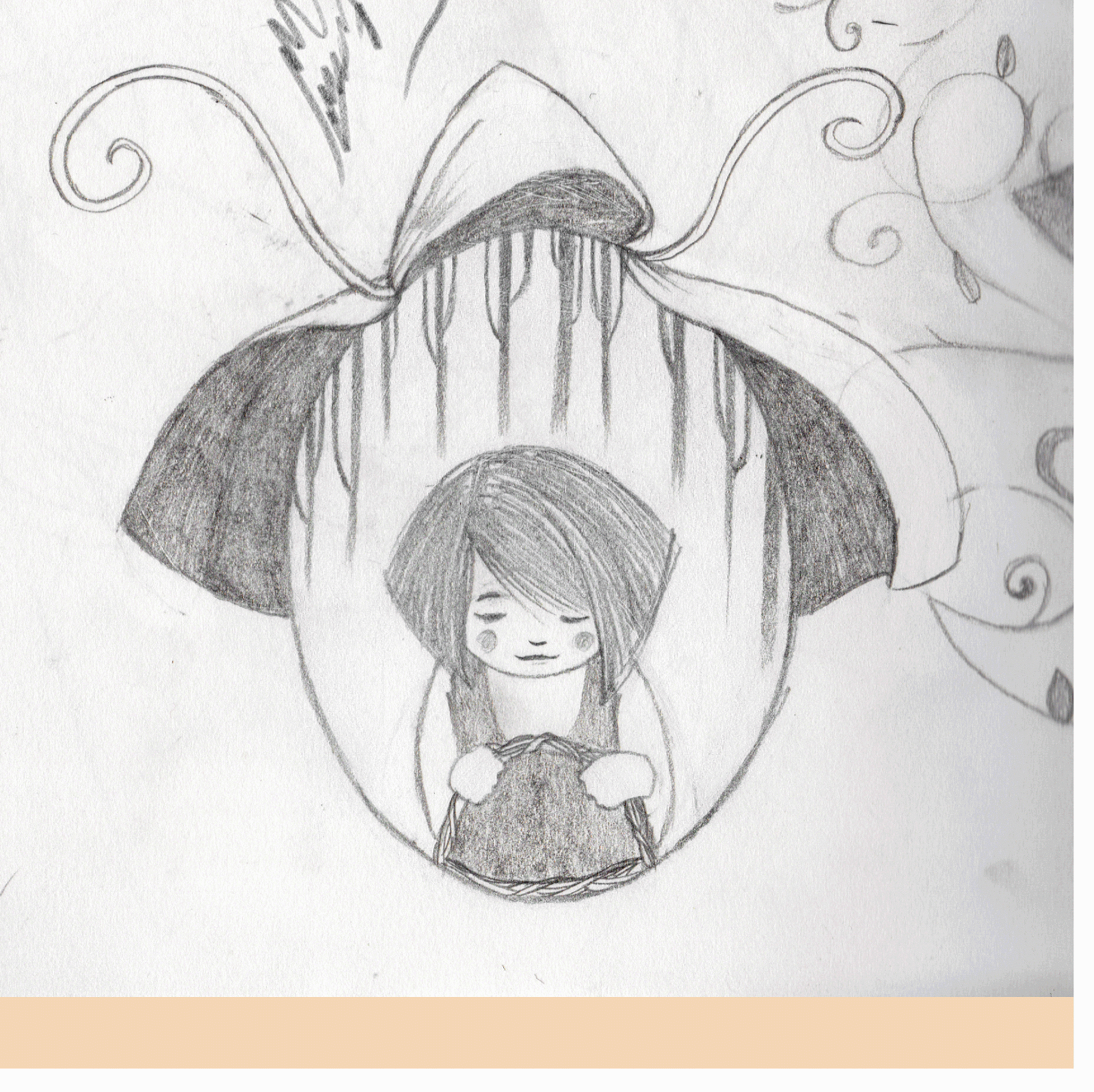
Tracy and I went to a conference last Saturday (we’ll give you the scoop in a future post). In the frenzied preparation to get my portfolio up to speed and create a new postcard, I was mining for ideas. Remember that not really true or maybe it is true story about knitting sweaters for penguins? Even Snopes isn’t sure about that one. Well that gave me a great idea! I imagined a little girl knitting sweaters for penguins. Now to write a story to go along with it (which needs to include chickens).
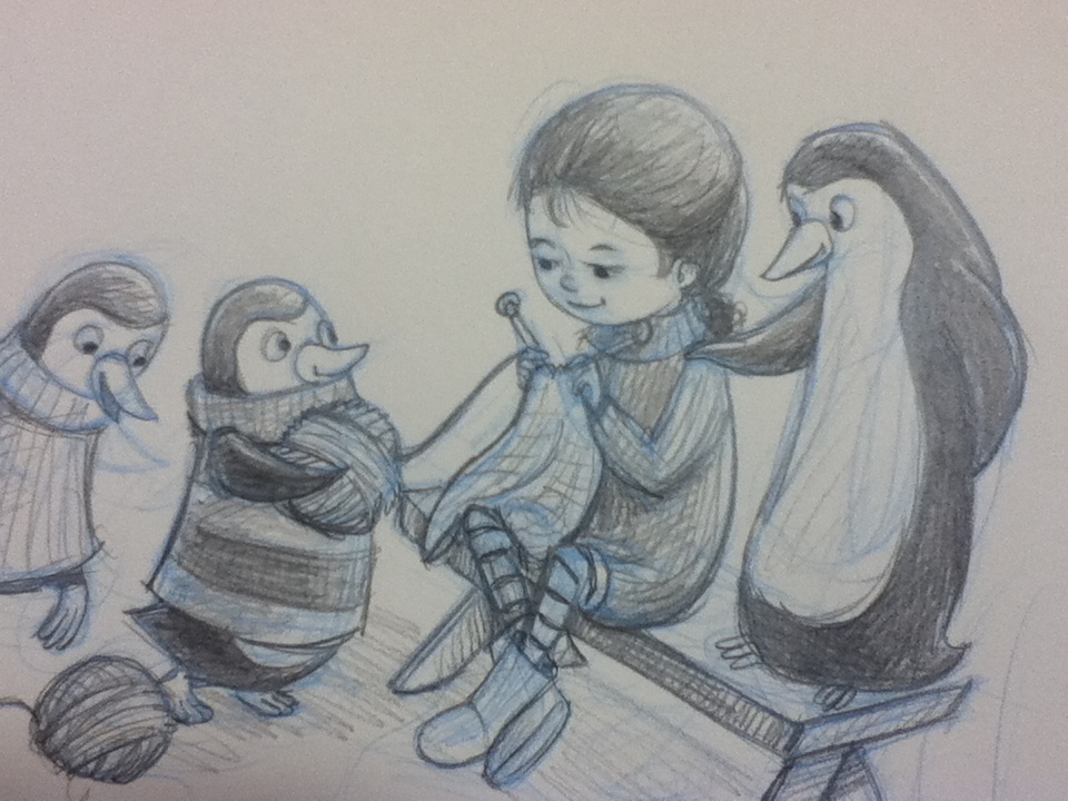 |
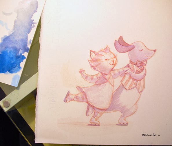
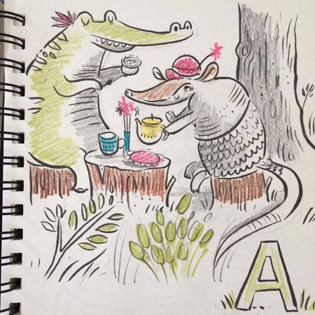
| First sketch on Instagram |
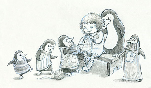 |
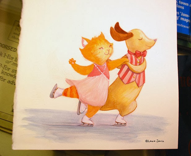
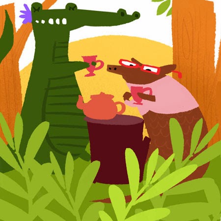
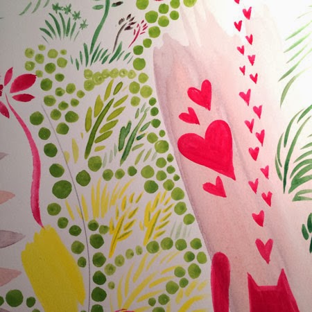
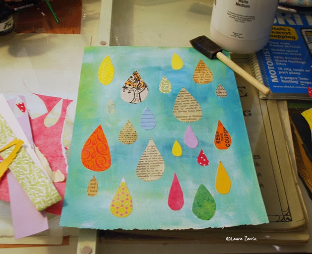
| Revised sketch |
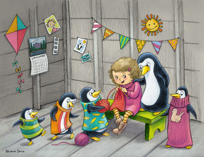 |
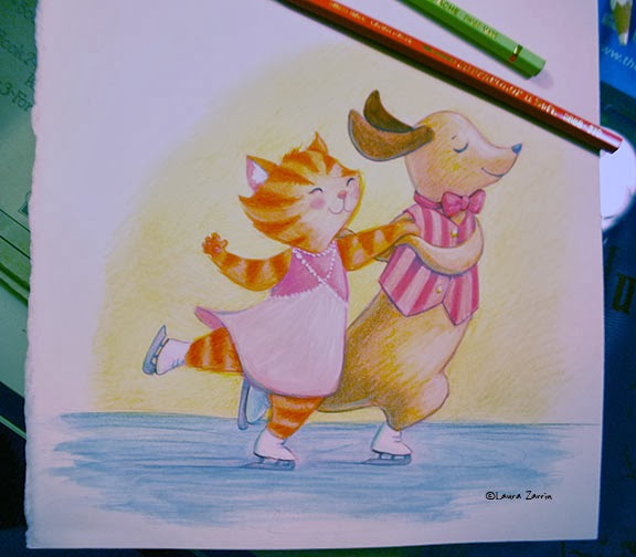
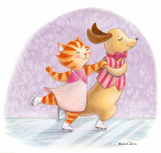
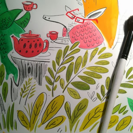
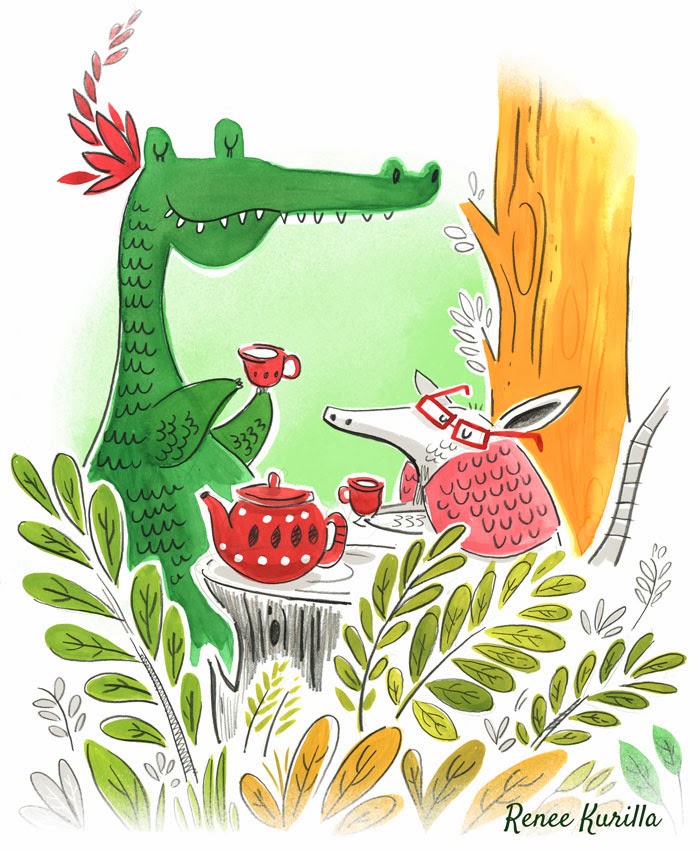
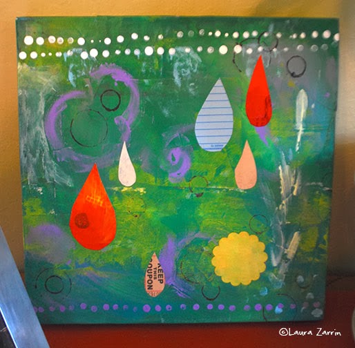
| Finished piece. |
I used this image as my postcard which is now en route to various publishers.
If you’re an editor, art director, art buyer or anyone else at a publishing house and would like to receive one, let me know!